
Shortly after moving to a new building on the Massachusetts College of Art and Design, the Center for Art and Community Partnerships (CACP) asked me to design signage that could help students find their office and reduce the constant confusion of the 8th floor's bizarre layout. I created a system that could work across a floor of nine different offices, designed five signs, and installed the large vinyl stickers myself.
The 8th floor, while all sharing the similarity of being MassArt offices, had very little in common; no uniform branding, no colors, and no offices numbers (they had been removed to reduce confusion — it did not reduce confusion). So I took inspiration from MassArt's school-wide branding and used a diagonal motif to create some interest. I chose a round, friendly, easy-to-read typeface and rounded the edges of the arrows to match.


Recently the print lab installed large-scale vinyl stickers on every floor of the Tower Building's elevators and each floor features art from MassArt faculty. Since the 8th floor had no color scheme at all besides white walls, I took inspiration from the elevator art and decided on a bright maroon-purple that was featured on all eight of the elevators on this floor.

After designing the A-frame, I took the same elements and applied them to the Registrar's sign. Every sign on the 8th floor had different lists of offices, as well as different directional arrows depending on which you had passed.
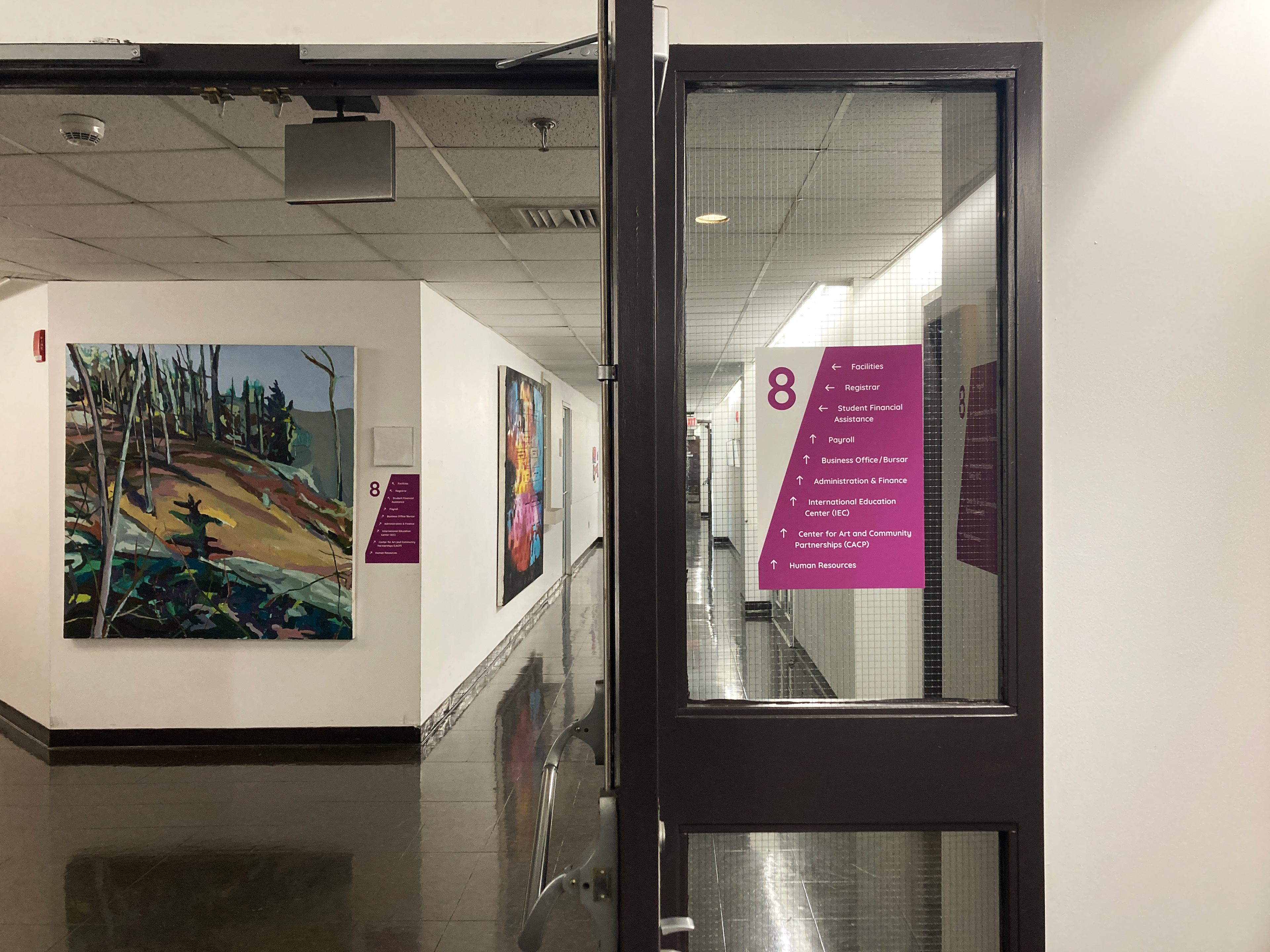
This area needed a lot of signage because of the three different ways of reaching this intersection, so I designed and installed one on the window, one on the wall to the left and behind the window (by the painting), and one perpendicular to the window on the wall behind it.

This is the view of the sign on the wall behind the window. From this angle you can't see the sign by the painting just around the corner to the left, so another sign was needed to get a person's attention.
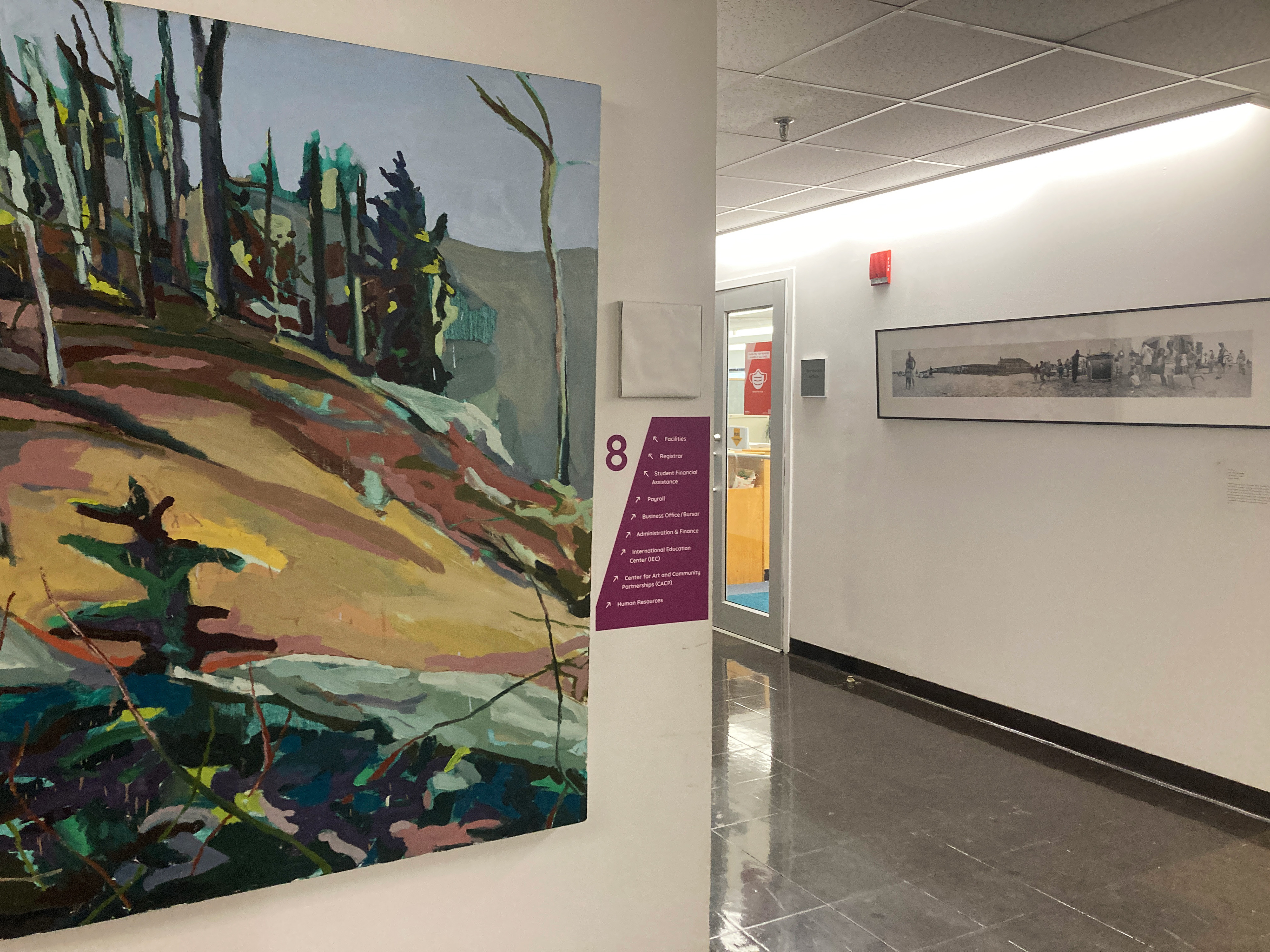
Finally, this is a closeup of the intersection sign. The arrows are pointed diagonally due to the strange shape of the hallways on either side of it. It's also skinnier than the other signs due to the limited space on the wall.
This is an on-going project and I am currently working on signage for the CACP office itself, which will have its own identity system.