
PVRIS (pronounced “Paris”) is a pop-rock/electro-pop band from Massachusetts made up of singer and multi-instrumentalist Lynn Gunn, bassist and keyboardist Brian MacDonald, and guitarist Alex Babinski. I reorganized their discography into three new albums, and designed album sleeves for each, as well as created a lyric booklet to go inside the box.

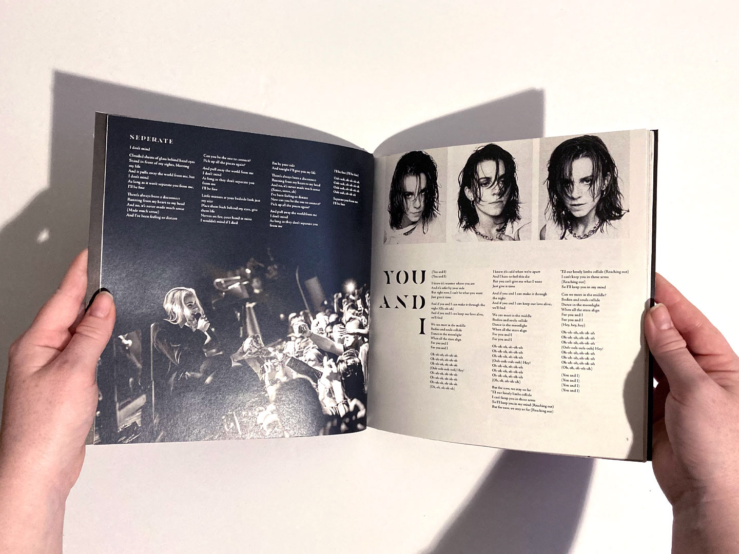
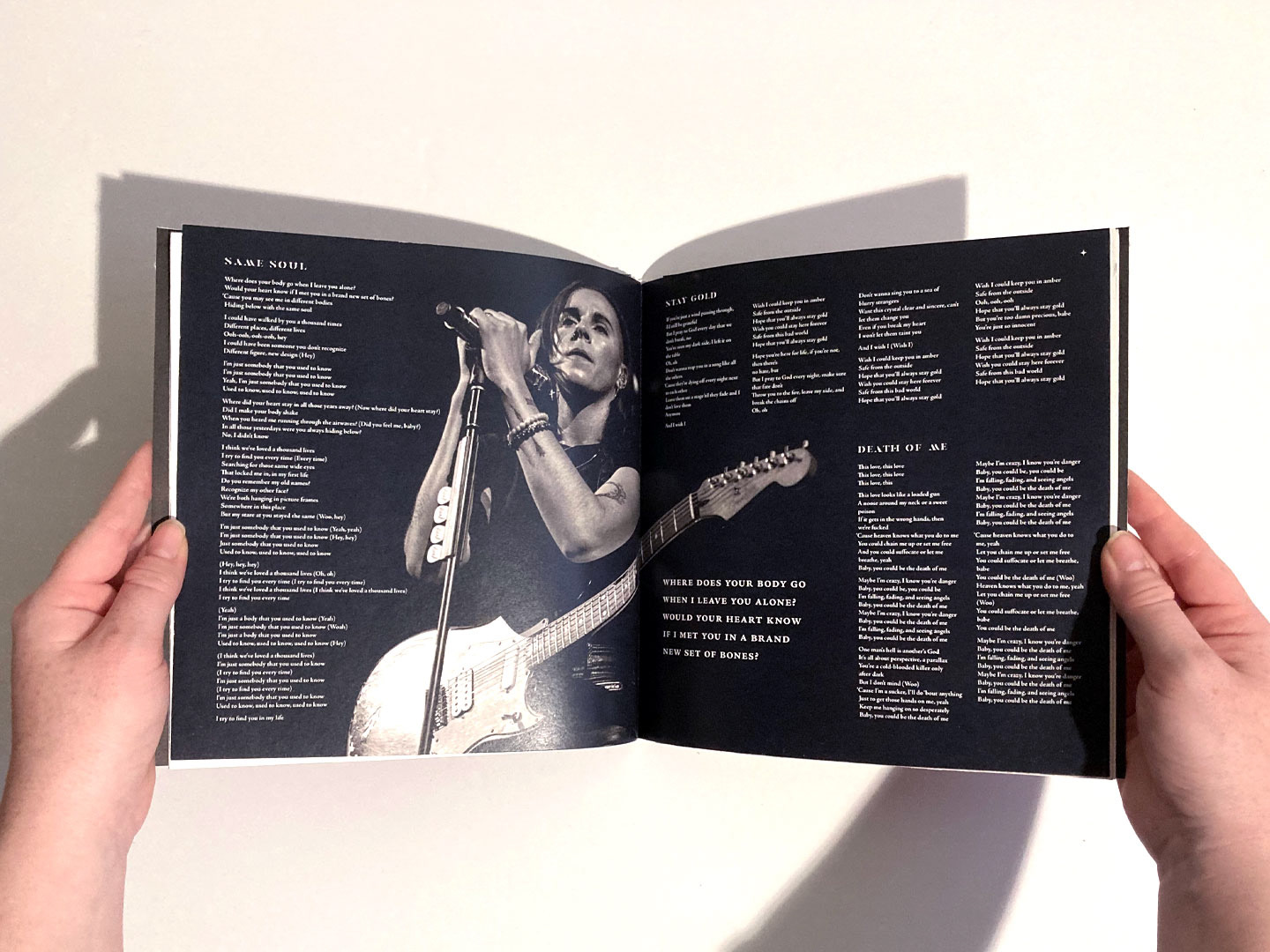
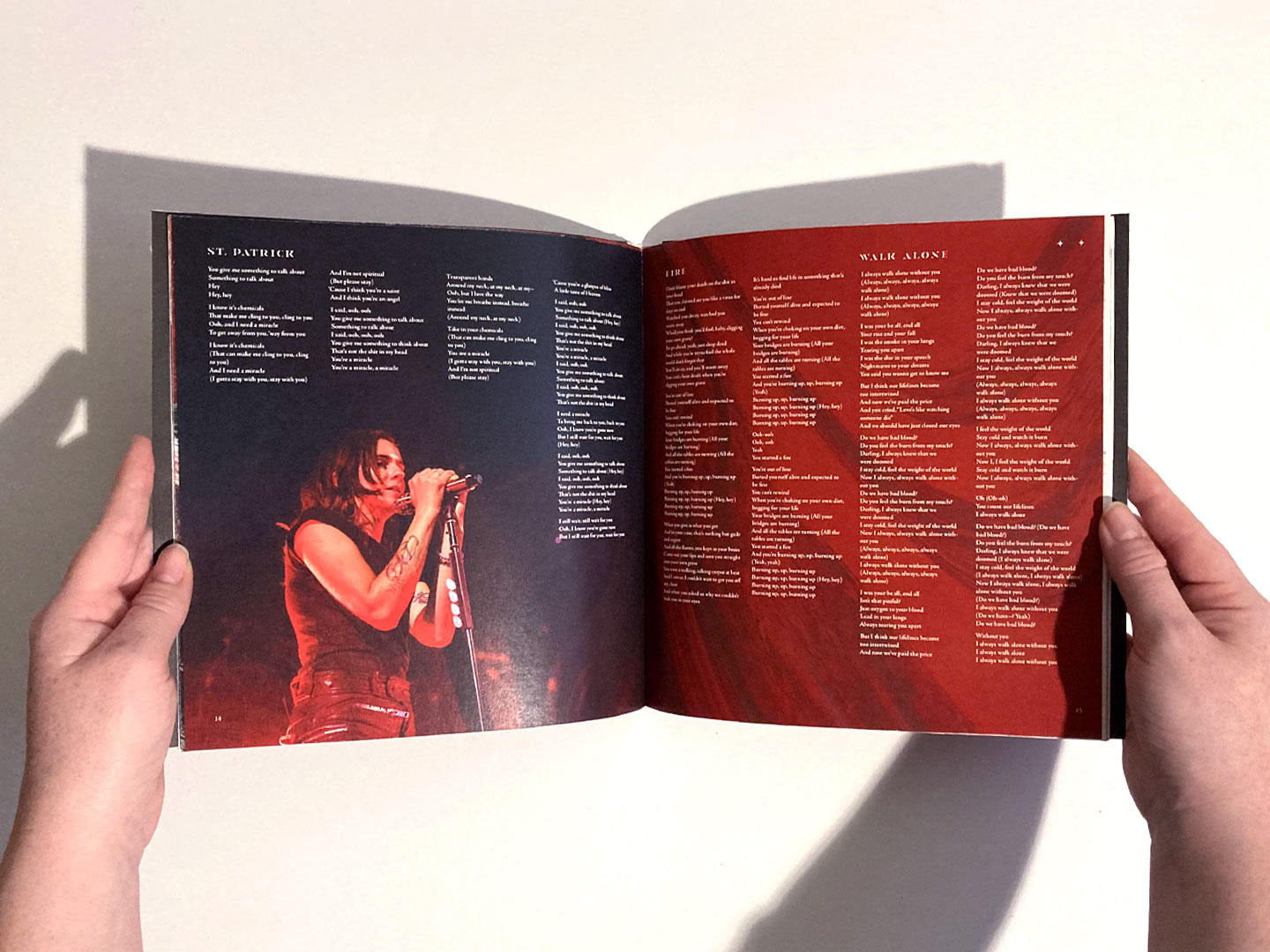
In the last decade PVRIS have released three albums and three EPs and have collaborated with many other artists. Their instrumentals are gritty and loud in the pop-rock tradition, but in combination with Gunn’s vocals and their electronic beats they are unique amongst an established genre. Almost all of PVRIS’ songs have very similar themes of introspection, growth and regression, love, and drifting apart from people you loved. Their similarities allowed for the tracks to be rearranged into three themed compilation albums. The first album is titled after their song You and I, which is about loving someone else and how being with them changes you. The second is titled Walk Alone, and is the direct sequel to the first album, focusing on breakups and the effect they have on you. The third and final album, Good to be Alive, is about personal growth and introspection. Despite Gunn’s lyrics having generally sadder tones, they seem cathartic and weren’t necessarily pessimistic — maybe not exactly optimistic, but hoping to be someday.

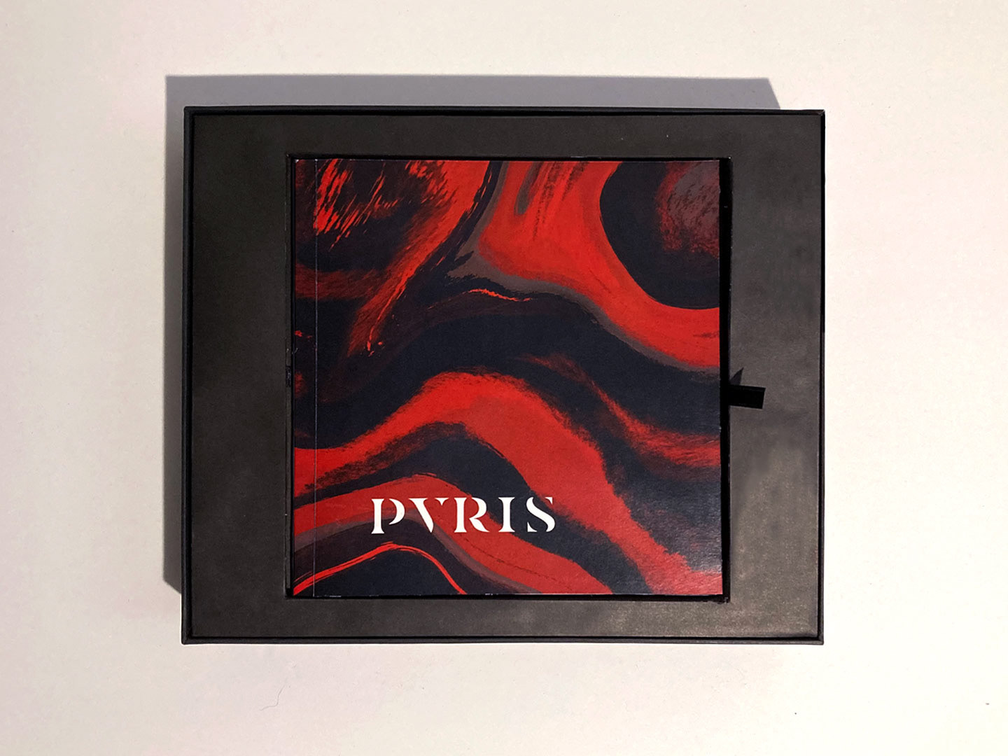

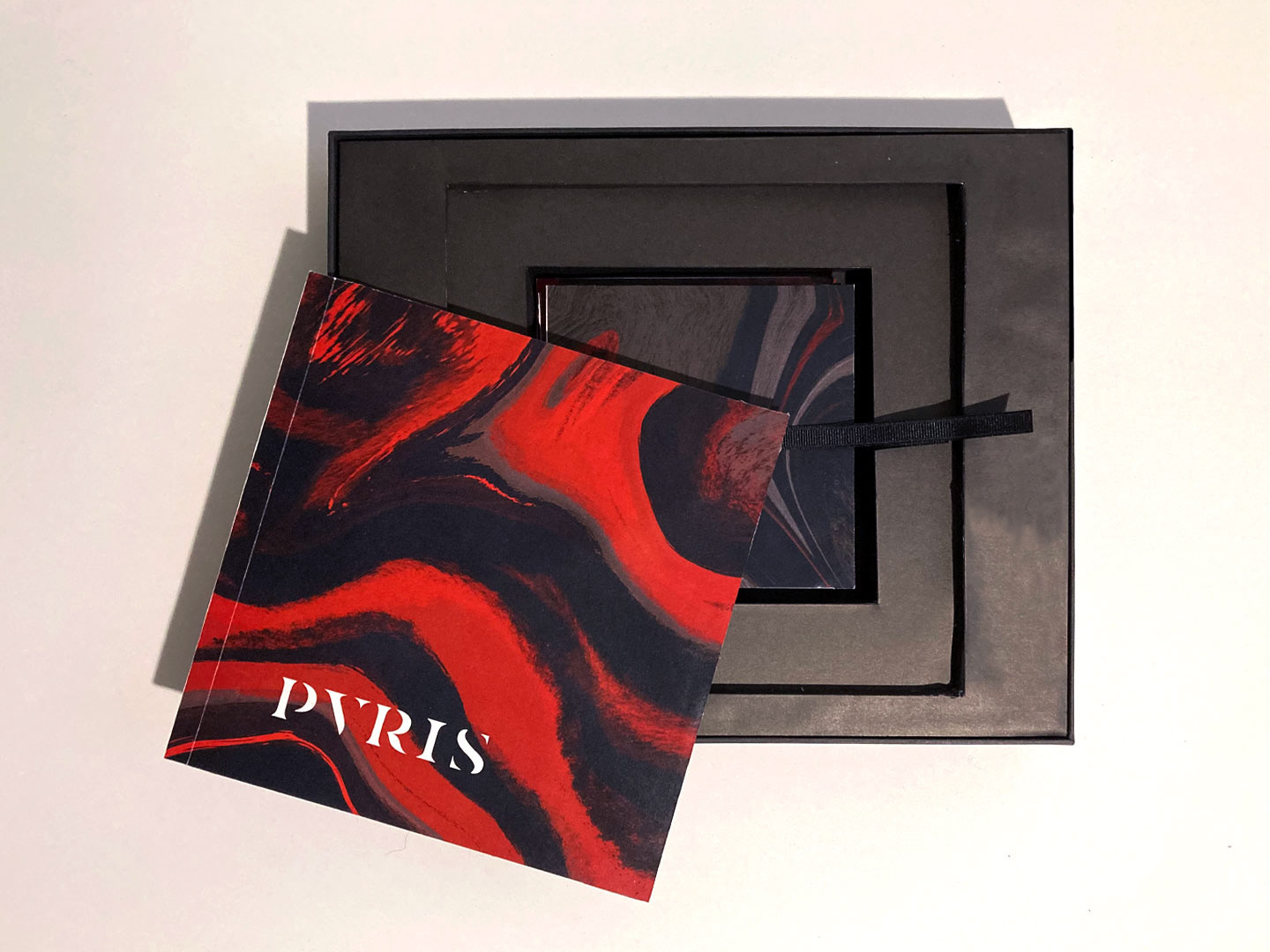

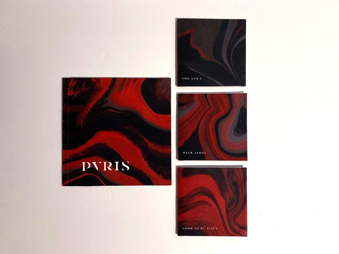

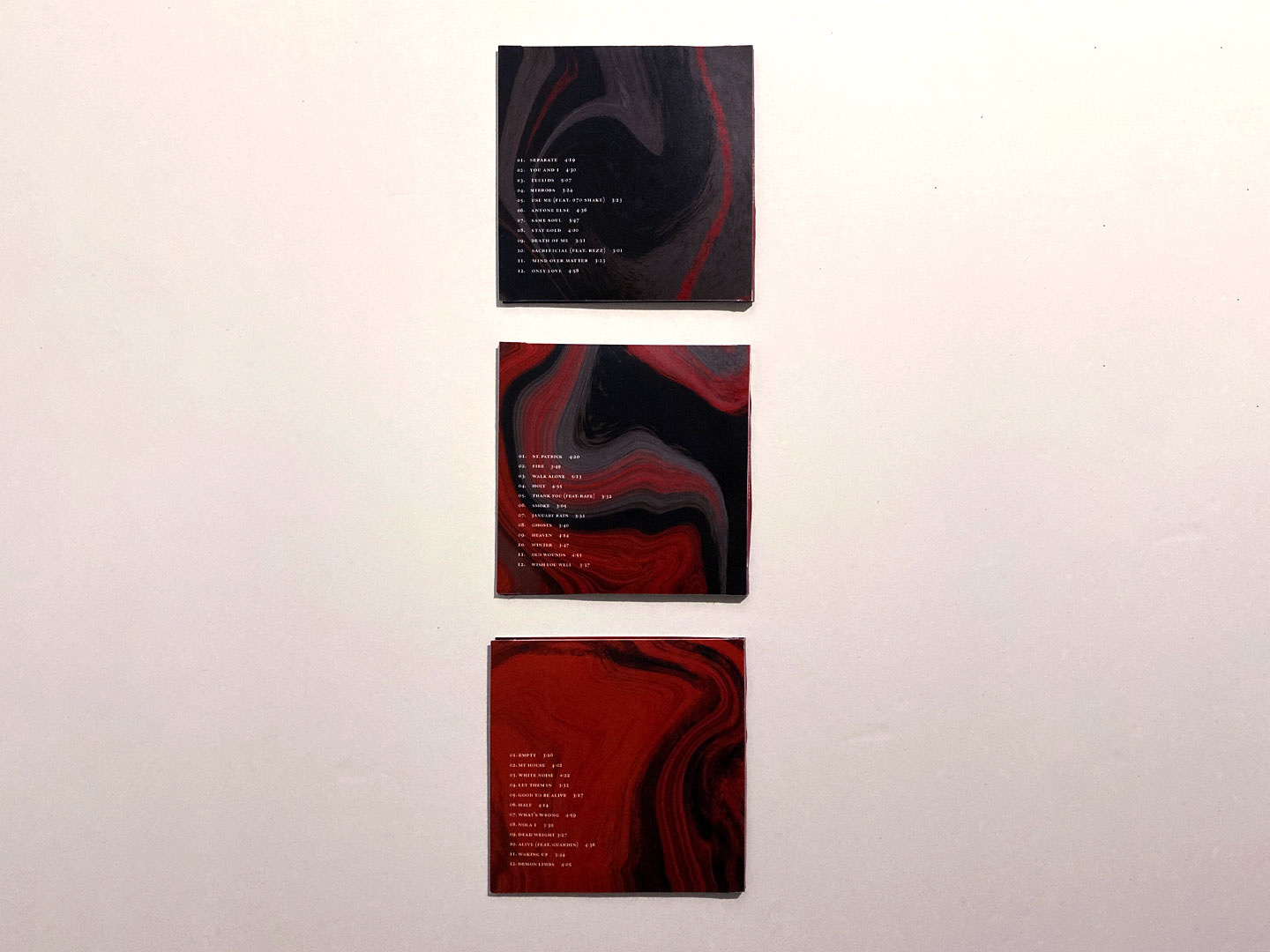

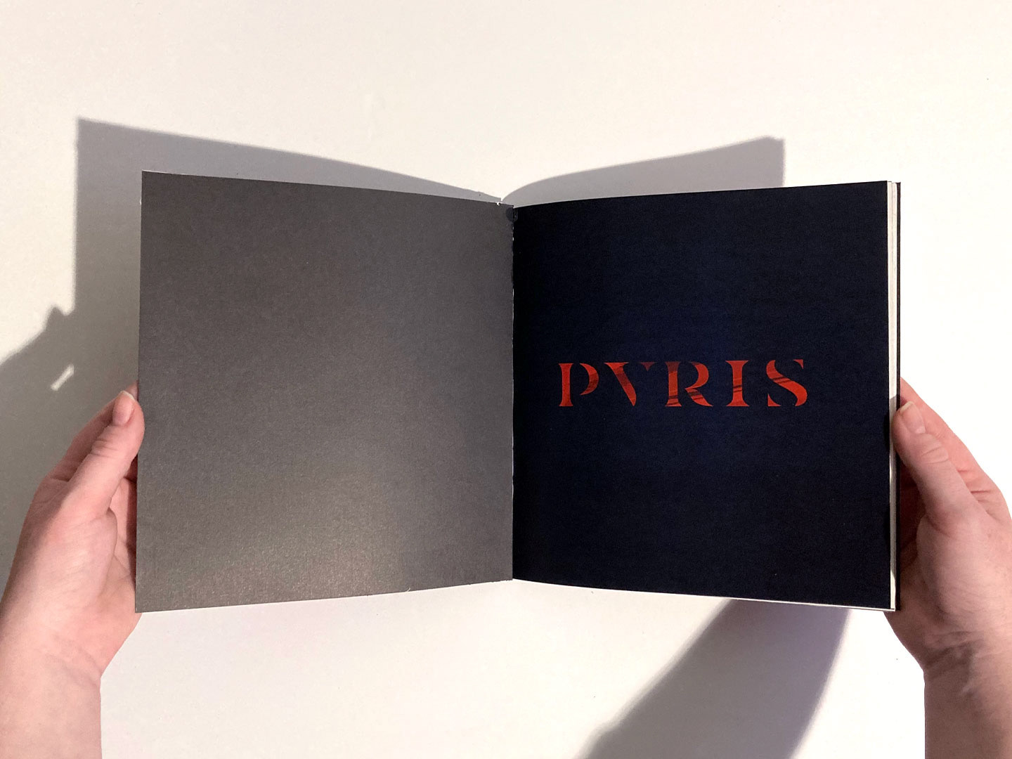
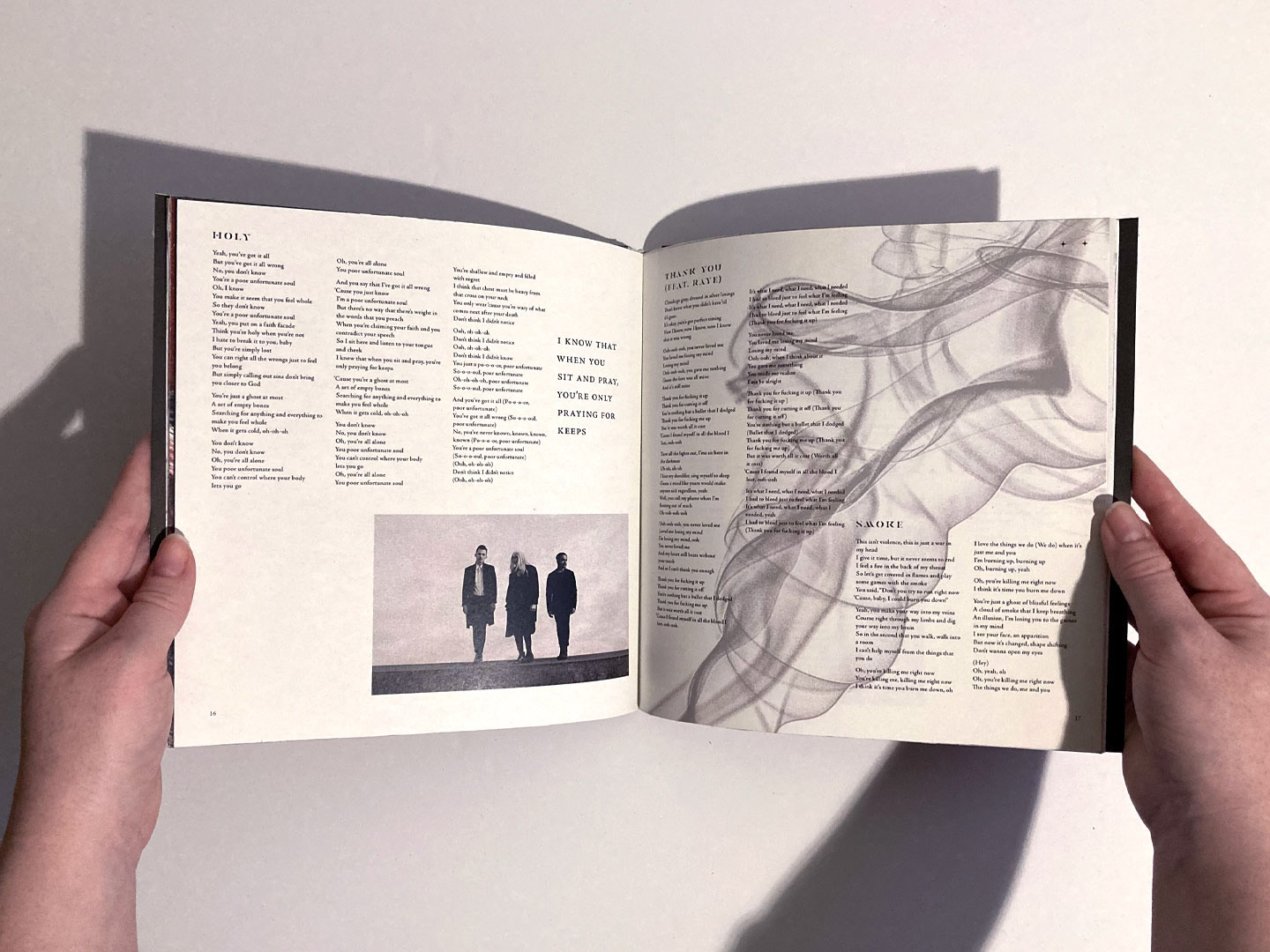
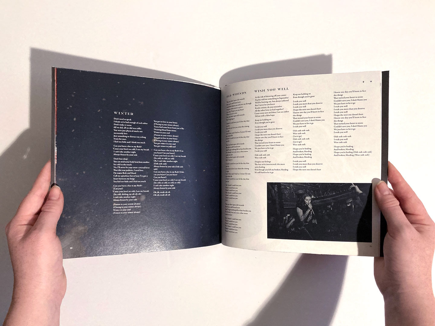
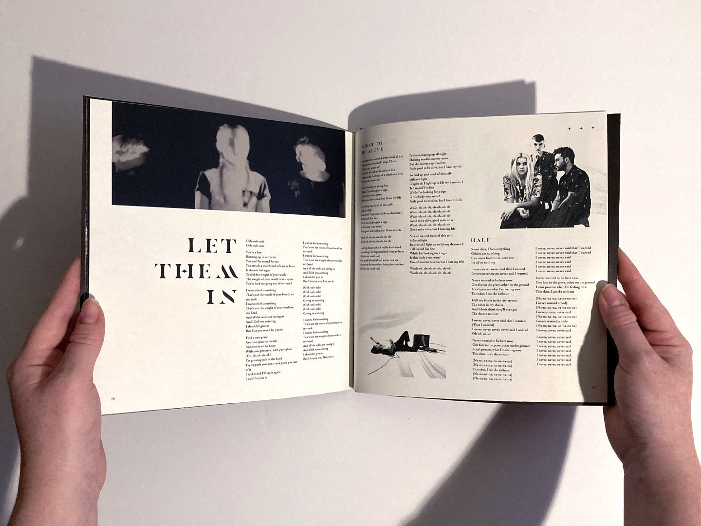
PVRIS being one of my favorite bands made this project sentimental for me. I wanted to embody the uniqueness of Gunn’s vocals and the flowy soundscape of their music, but also tie in their clear visual identity they’ve grown into. The covers of the three albums and the booklet have the amorphous, flowy texture that, and I kept the color palette bright, saturated red, black, gray and white. The albums are cardstock folders with the name of the album on the front, and spine, the quote from the lyrics the album is named after on the inside, and the tracklist on the back. The booklet includes an essay I wrote about the band and the lyrics of each song broken up into three chapters. I brought the amorphous textures into the images in the booklet as well. On the cover of the box I laser-cut the name PVRIS in the stencil typeface Casa as it reflected the flowiness I kept referring back to. I used the same typeface for the titles of the albums and booklets, and for the rest of the body type I used Adobe Jenson for its diamond details. I thought the combination of these two typefaces, one flowy and the other classic and a little gothic-looking) fit the mood of PVRIS’ songs.


The box itself is 10 inches long, 12 inches wide, and two inches tall. The booklet is 8 inches wide and long, and the albums are 5 inches wide and long, folded, and 10 inches wide flat.