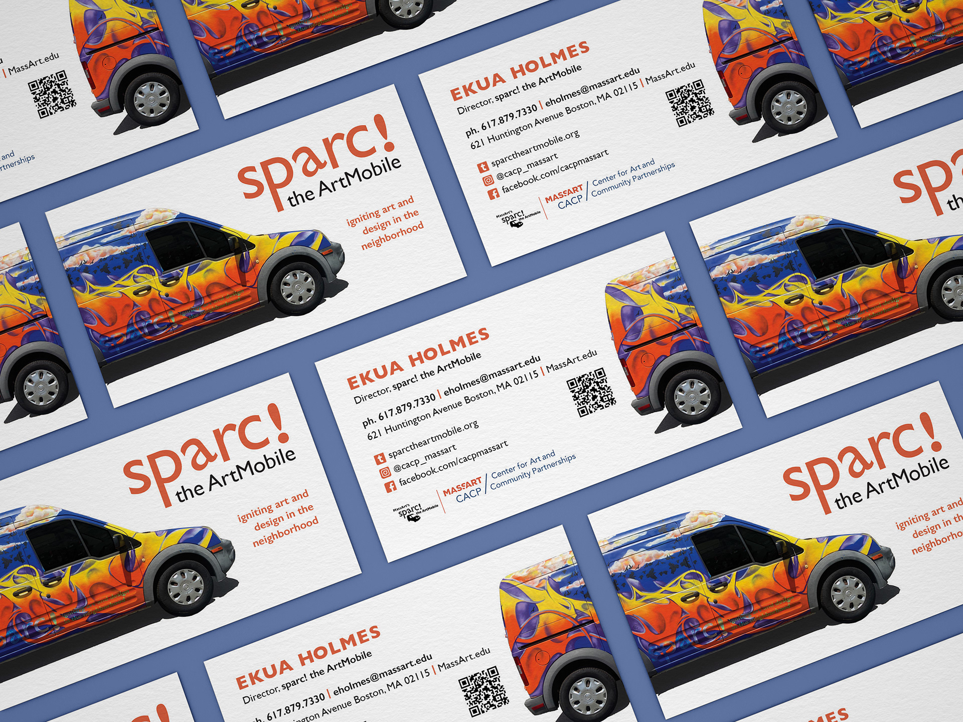


While working for the Center for Art and Community Partnerships (CACP) at MassArt, I was asked to redesign the sparc! the ArtMobile business cards. sparc! the ArtMobile aims to cultivate innovative, sustainable relationships with the broader community to explore and expand the relevance of art and design in public life.
sparc! (the van) travels the city as an all-purpose art studio on wheels collaborating with community organizations, schools, libraries and artists to create innovative and intergenerational workshops, programs and special events. With projects designed to stimulate cross-cultural conversations and build community, sparc! ignites art and design in the neighborhood.

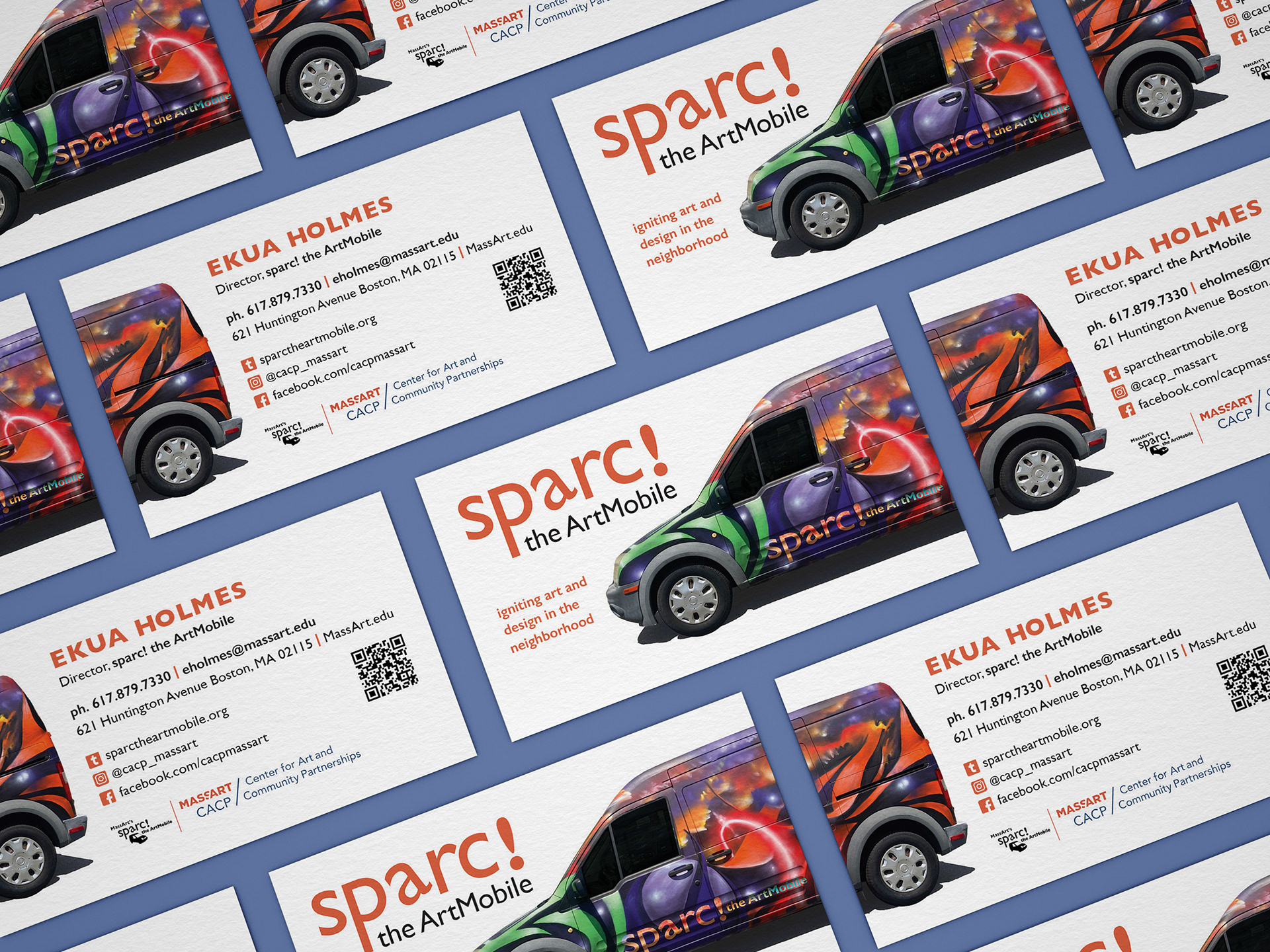
The sparc! progam recently had its 10th anniversary and the van was spray-painted by two local graffiti artists with a new wrap. The old business cards depicted the original wrap, so they were in need of an update. Since the van is so iconic I wanted to make it the focus-point on the cards. And since the van and the sparc! team are always on the move I had the van go around the side of the business cards to imply motion.
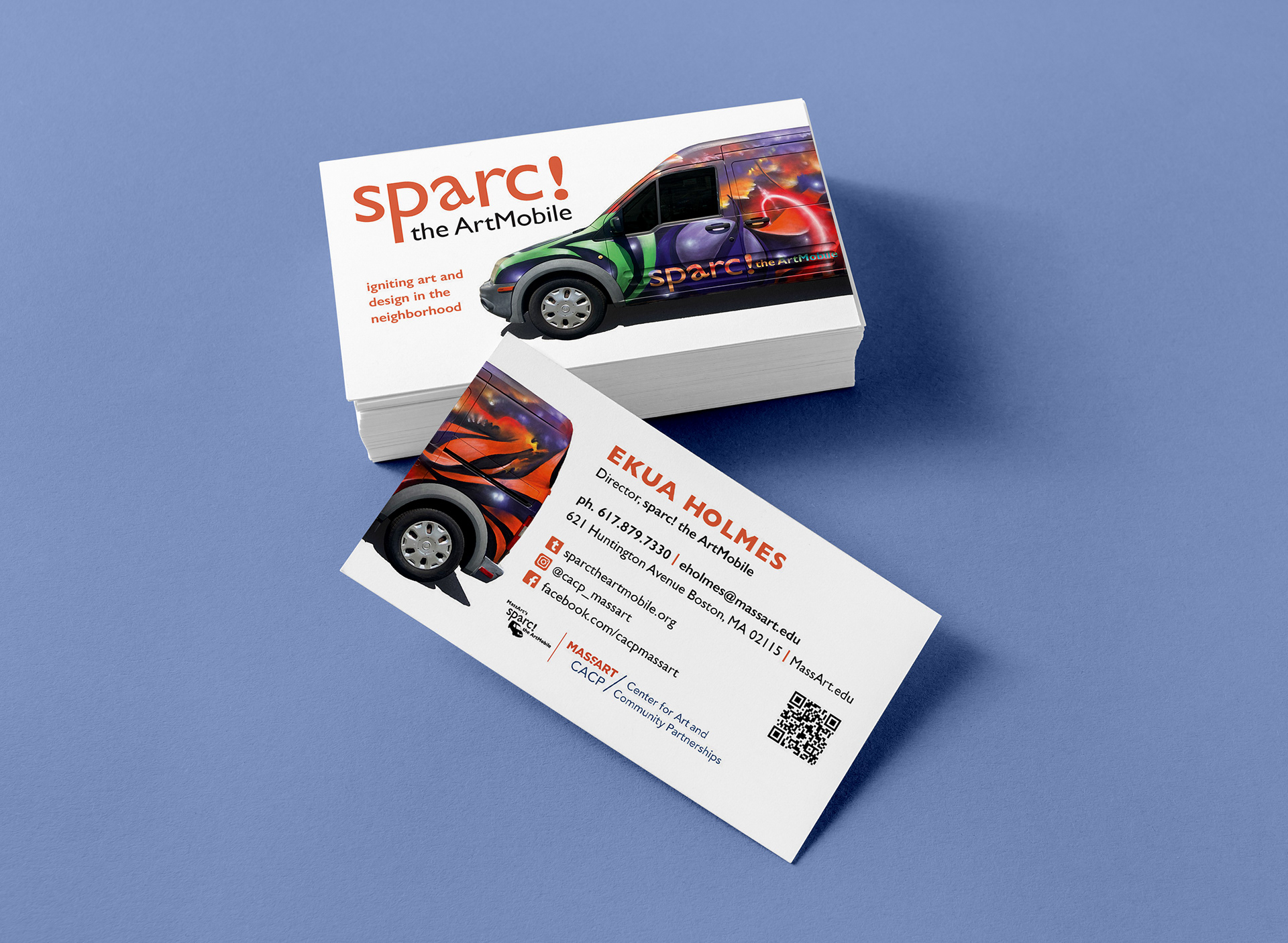
The van has two distinct designs on the left and right sides, and we couldn't decide on one or the other so we decided to print both.
sparc! already had a logo (as seen at the bottom left of the backside of the card) but I felt it didn't make sense to have a photo of the van and an icon of the van on the front, so I took some liberties with the wordmark and moved "the ArtMobile" under the large "sparc!" complete with the titled lowercases a that was already in their branding.